Monochromatic Magic: When to Choose Black & White
There’s a moment we’ve all had: staring at a photo in Lightroom, finger hovering over the “black & white” button like it’s a detonator. Should I leave it in color, or should I strip away every hue like a painter suddenly angry at the rainbow?
Choosing between color and black & white isn’t just an editing decision. It’s a crisis of identity. Are you a “let’s keep it real” straight out of camera type, or are you about to go full French art student chain-smoking outside a café chasing that “fine art” acclaim? Honestly, the answer changes by the photo. And sometimes by how long you’ve been editing that day.
Here’s your field guide to knowing when to kill the color:
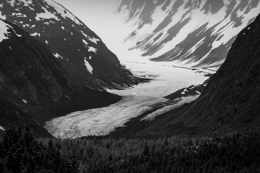
High Contrast: Let the Shadows Do the Talking
Picture a mountain shot with snow and ice slashing across black rock. In color it’s… fine. Pretty. Something your cousin would say is “beautiful” before moving on to cat videos. In black & white, though, the scene smacks you in the face. The hard lines of light and dark, the jagged geometry, the raw texture. They all come alive when color gets out of the way.
If your photo already looks like it’s halfway to a chessboard, do everyone a favor and finish the job. Black & white thrives on contrast. It’s macaroni & cheese for your eyeballs.
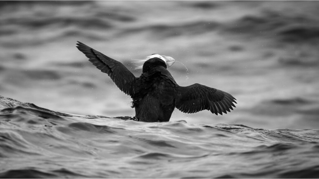
Little Color to Begin With: Sorry Murres, You’re Drab Anyway
Let’s talk about common murres perched on a rocky sea cliff. Their feathers are a tasteful blend of white and blackish-brownish-not-quite-anything. The rocks? Gray on gray with some bonus streaks courtesy of bird droppings. If the most exciting color in your shot is a green shade of bird poop staining the rocks, you’re not gaining anything from color.
But black & white? Suddenly the cliff becomes a graphic study in texture. The birds look like deliberate brush strokes instead of drab smudges. Penguins, pandas, orcas; if your subject is already wearing a tuxedo, try stripping away the color. They’ll thank you.

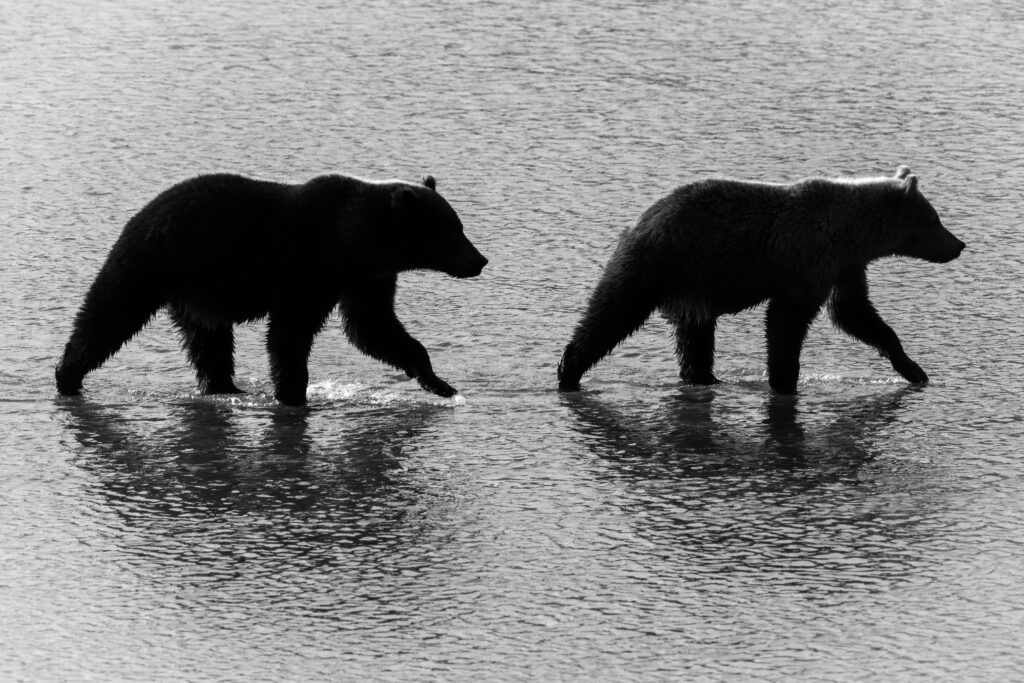
Silhouettes: Shadow Puppets for Adults
A bear outlined against the water doesn’t need color. It barely needs context. The whole point is the shape. The posture. The “I’m a bear and you’re not” vibe.
Silhouettes are already halfway to monochrome, so just commit. Black & white sharpens the edges and makes your subject feel monumental. Think shadow puppets, but for people who paid way too much for camera gear.
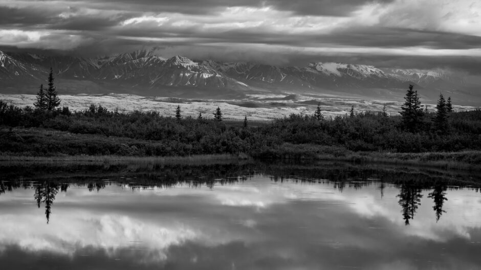
Stormy Skies: From Meh to Apocalypse
Storm clouds are notoriously tricky in color. In person they feel electric. In photos they often look like… soup. A flat, uninspiring vat of blue-gray pixels.
But drop the color, add some contrast and suddenly you’ve got texture…weight…menace. Your moody day over a pond in Denali National Park? In color it whispers. In black & white, it’s the villain’s entrance scene. Reflections of those same clouds in the water below doubles the drama.
Color tries to show you fifty shades of meh. Black & white shows you the storm that swallowed the mountains.

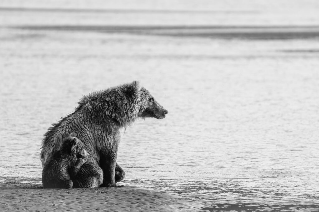
For Emotional Impact: Cue the Sad Piano
Sometimes color distracts from the story. Take a mother bear staring off across the bay. In color, your eye wanders to the russet tones of its fur or the brown mud in the corner. In black & white, all you see is the expression. The eyes. The lines in the fur.
Stripping color is like adding Sarah Mclachlan to a pet shelter ad. It’s manipulative, sure. But it works. You want people to feel something? Drop the saturation and turn up the emotion.
Soft Focus Savior: Black & White to the Rescue
Not every shot is tack sharp. Maybe your subject twitched. Maybe your hands shook. Maybe you were trying to swat a mosquito while pressing the shutter. Whatever the reason, your “perfect” image came out softer than a hotel pillow.
Here’s the hack: black & white hides your sins. Our eyes read monochrome as sharper because we focus on edges and contrast, not blur. That slightly fuzzy photo that made you groan in color suddenly looks moody, intentional, maybe even artsy.
It’s not magic. It’s duct tape. But sometimes duct tape is exactly what you need.
The Takeaway: Stop Agonizing (But We Know You Won’t)
So when should you kill the color?
- When your scene is all highlights, shadows, and contrast
- When your scene or subject is already muted colors
- When clouds are brooding but boring in color
- When silhouettes are the whole story
- When emotion deserves the spotlight
- When camera focus failed you and you need a lifeline
Of course, you’ll still overthink it. That’s what we do. You’ll flip back and forth between color and monochrome until can’t look at it anymore. Maybe you’ll post both versions on Instagram and let strangers fight it out in the comments. Whatever works.
The beauty of traveling to photograph in remote and wild places is that you get both options, often in the same day. Alaska, for example, hands you stormy skies, moody ponds, expressive bears, and stark silhouettes before you’ve even finished your lunch. On a photo trip to the Last Frontier, you’ll come home with the best kind of editing problem: deciding whether to leave the color or kill it.
Either way, you win.
Happy Photographing,
Leave a reply